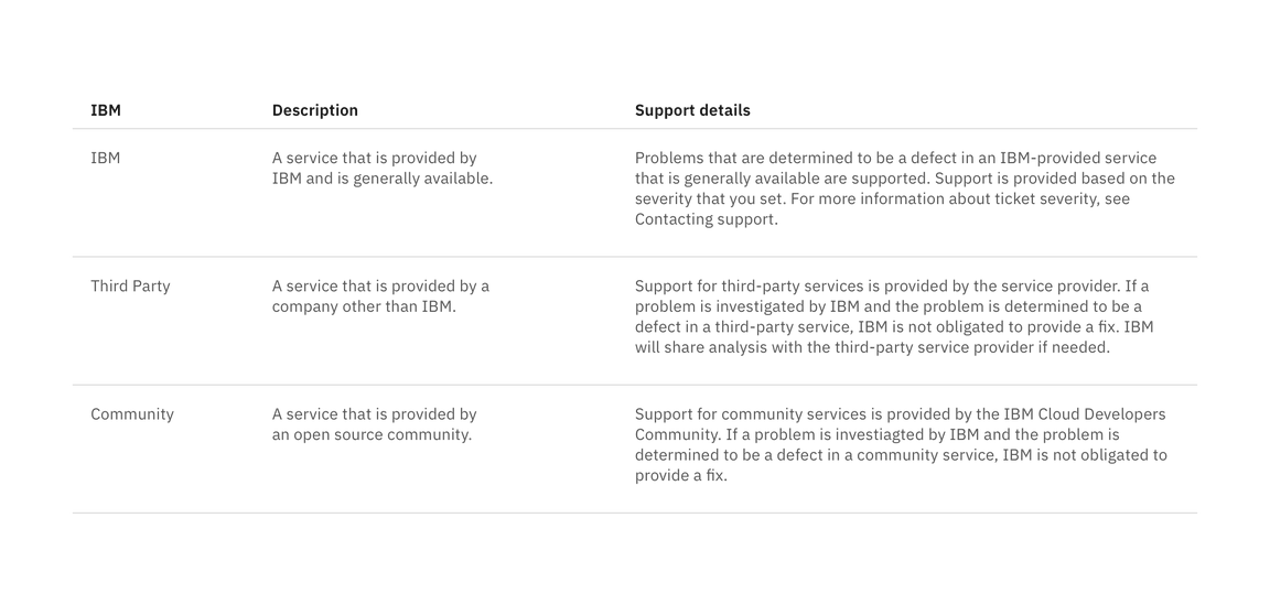
Structured list
Structured lists group content that is similar or related, such as terms and definitions.
ColumnA
ColumnB
ColumnC
Row 1
Row 1
Lorem ipsum dolor sit amet, consectetur adipiscing elit. Nunc dui magna, finibus id tortor sed, aliquet bibendum augue. Aenean posuere sem vel euismod dignissim. Nulla ut cursus dolor. Pellentesque vulputate nisl a porttitor interdum.
Row 2
Row 2
Lorem ipsum dolor sit amet, consectetur adipiscing elit. Nunc dui magna, finibus id tortor sed, aliquet bibendum augue. Aenean posuere sem vel euismod dignissim. Nulla ut cursus dolor. Pellentesque vulputate nisl a porttitor interdum.
Content
- Row height varies based on content and can expand to fit multiple lines.
- In a single list, all rows do not have to be the same height.
- Column widths can either be equally proportional or proportioned based on content.
- If a list extends past 25 items, consider using a data table to present this larger set of content.
- A maximum of one paragraph of text is recommended per row.
- Nesting items is not recommended, as structured lists are used to present simple data. If you have additional content that needs to be shown, consider using a data table, which supports nesting items.

Interactions
Structured lists can be single-select if a user is choosing between a set of options.
Guidelines:
- Only one item can be selected from the list.
- By default, one option should be selected.
- If you need to select multiple items, use a data table.
- When the user selects an item from the list, the selected row will appear with
the
checkmark--filledicon.
Feedback
Help us improve this component by providing feedback, asking questions, and leaving any other comments on GitHub.