Text toolbars
A text toolbar is a set of buttons and menus that allows users to edit text, search keywords, attach files, and embed links.
Resources
Overview
A text toolbar is a set of buttons and menus that is grouped horizontally. These controls primarily allow text editing functionality. Formatting actions and style changes can be applied to the editable text within the text area below the text toolbar. Attaching files, embedding links, and searching keywords are additional functions a toolbar can have.
A text toolbar can be customized by adding or removing icon buttons based on specific user needs. This pattern illustrates the following options:
- Redo
- Undo
- Cut
- Copy
- Paste
- Typeface
- Type size
- Bold
- Italic
- Underline
- Text color
- Alignment
- Bulleted list
- Checked list
- Numbered list
- Indent more
- Indent less
- Attachment
- Link
- Search
Anatomy
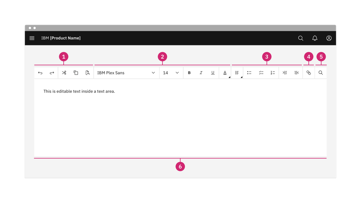
- Actions: Use “Undo” and “Redo” to undo or revert the last change made. Use “Cut”, “Copy”, and “Paste” to move pieces of text to another place within the text area, to copy text to the clipboard, or to paste copied text from the clipboard to a different place within the text area.
- Formatting: Change the typeface, size, style, and color of text.
- Paragraph: Select different alignments and indents for paragraph text and indicate bulleted, checked, or numbered lists.
- Attachment: Attach files or embed links in strings of text.
- Search: Search key words within existing paragraphs of text.
- Text area: Designated area to type editable text.
When to use
The text toolbar provides an efficient way for users to perform several tasks:
- Create, edit and save simple text files quickly.
- Edit text with common actions like cut, copy and paste and formatting text styles.
- Perform basic text search functionality.
- Attach files or embed links within text.
Behaviors
States
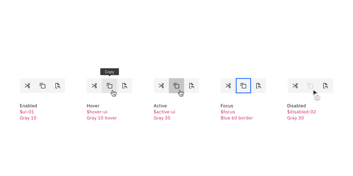
The text toolbar includes a series of basic actions that adopt the icon button style. The action buttons typically have five different states—enabled, hover, focus, active, and disabled.
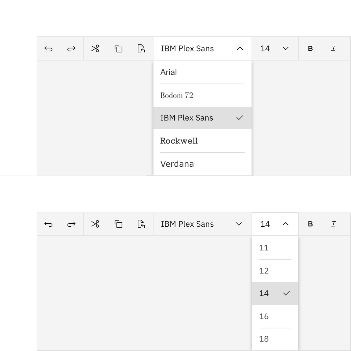
The typeface and type size menus adopt the dropdown style. The user can easily choose any typeface and type size to customize their text.
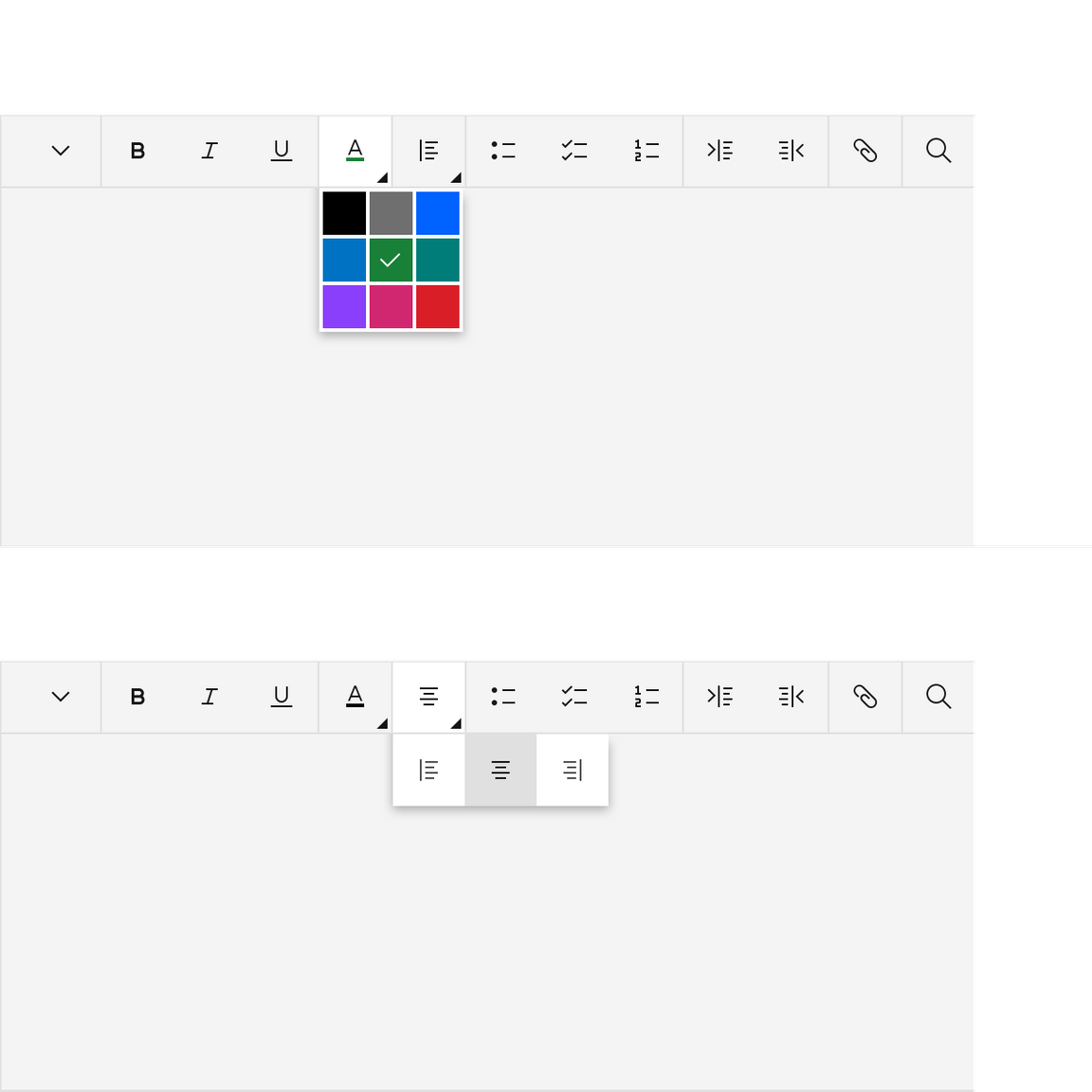
The text color and paragraph alignment controls open a menu that displays different options to choose from.
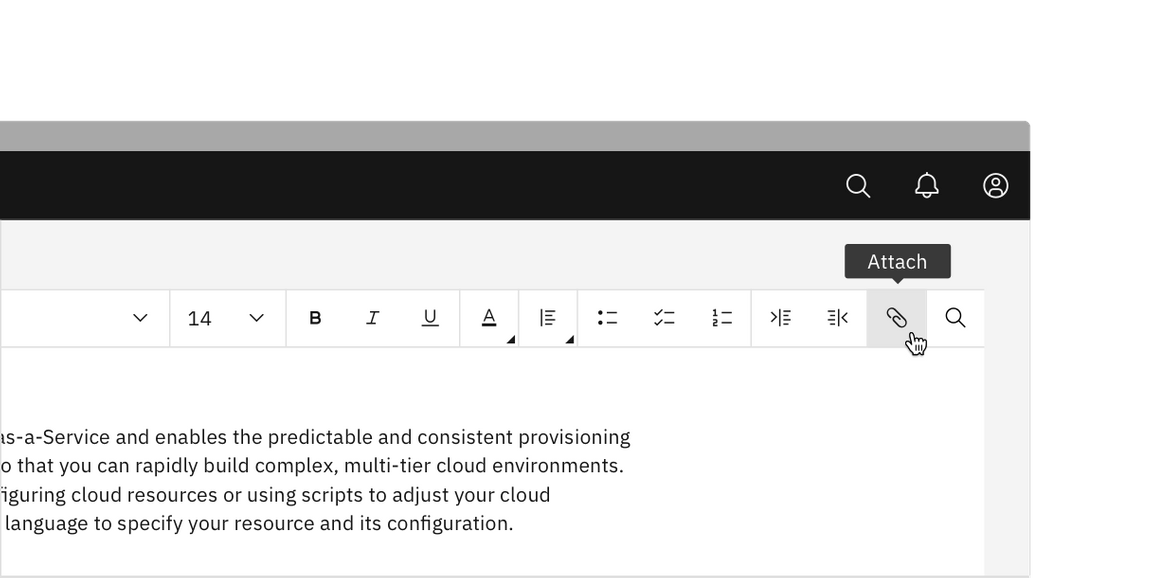
Attach files
The user can upload and attach a file from their computer.
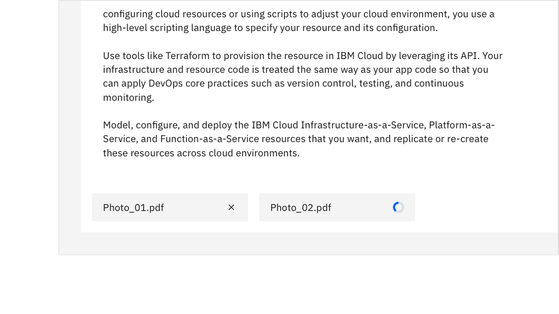
Once a file has been chosen, the file will load in the bottom left of the text
area. A file can be removed by clicking the close x icon.
Embed links
Links can be embedded within strings of text. To embed a link, click on the link button to open the text field.
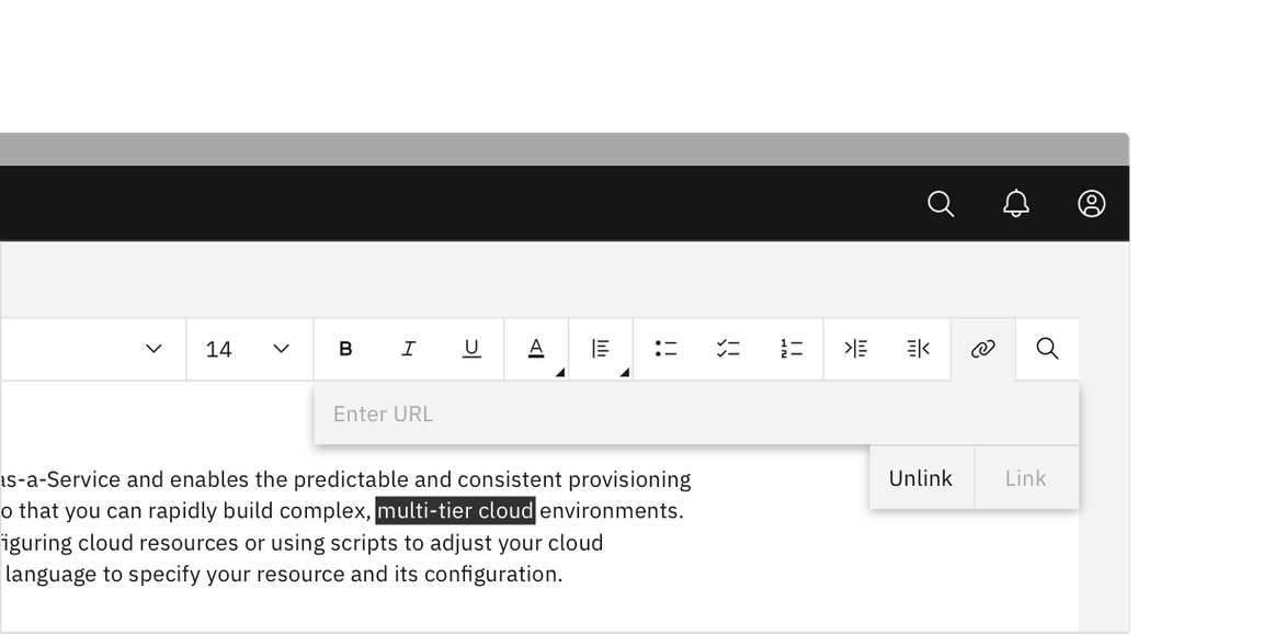
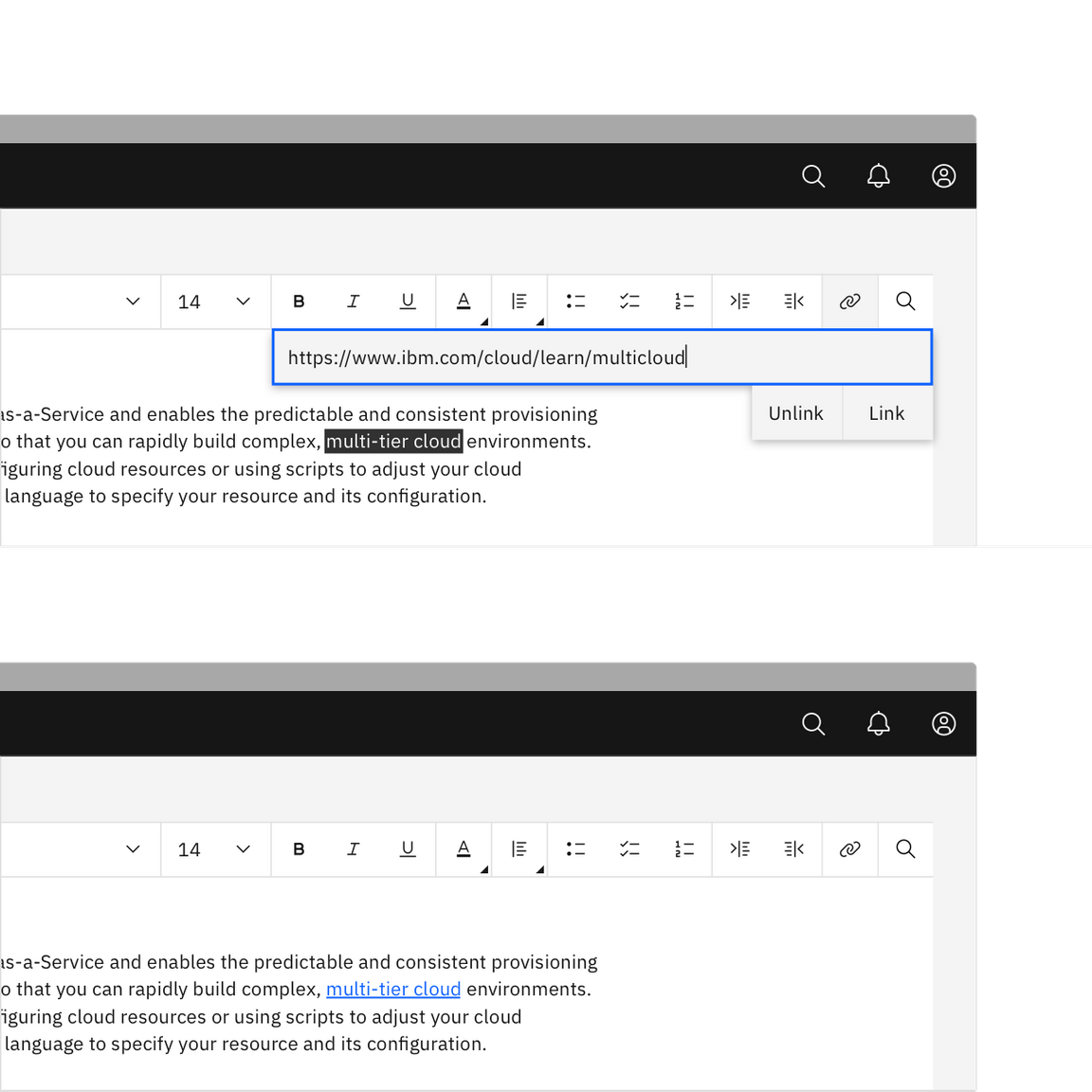
Enter the html link in the text field and then click the link button to embed
the link. To exit the text field, click the close x icon or anywhere outside
of the field. To reopen the link text field to edit or delete, highlight the
inline link text with the cursor.
Search
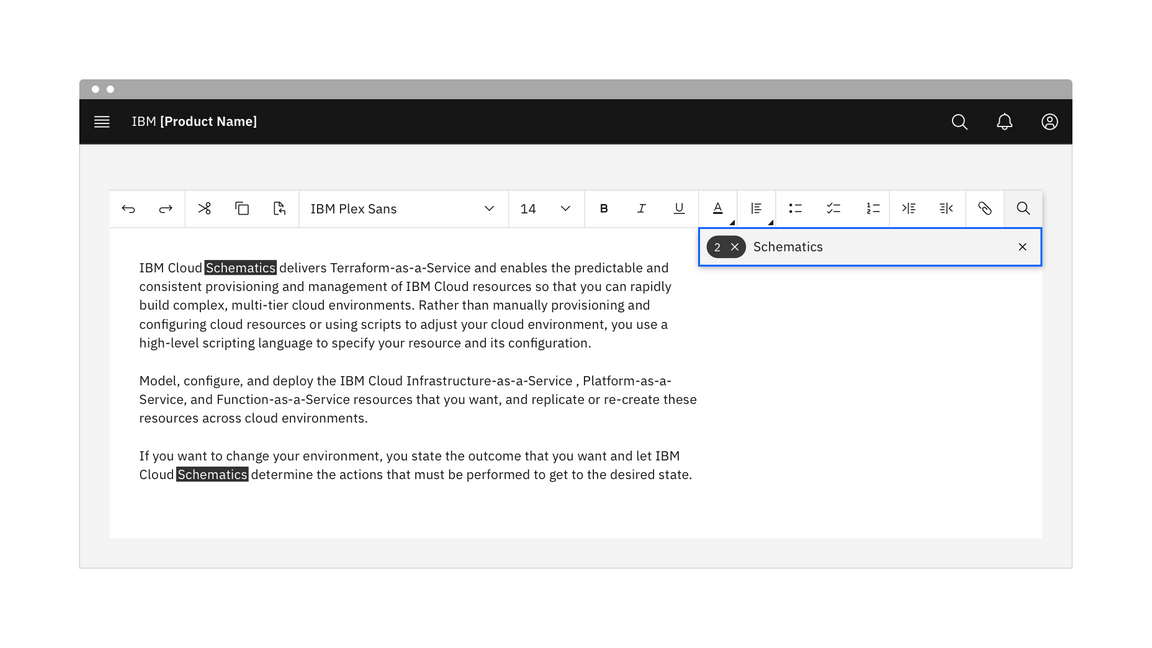
Keywords can be searched within the text area.
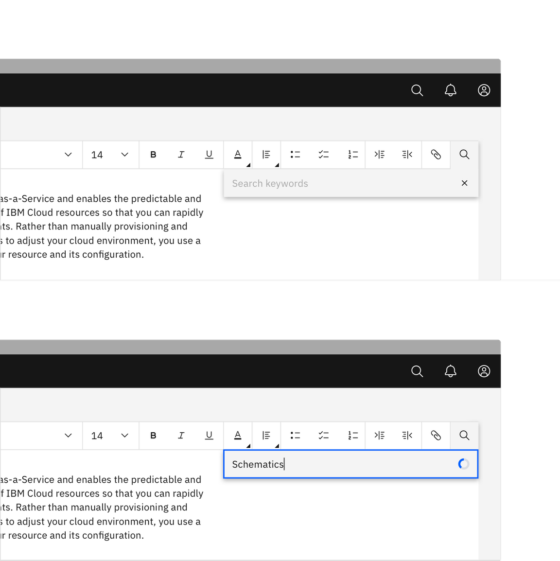
Matching search results are highlighted in the text area. The number of results
found is displayed within a tag in the search bar. The user can clear the search
by clicking the close x icon inside of the tag. To exit the search, click the
close x icon in the search field or click anywhere outside of the search bar.
Responsiveness
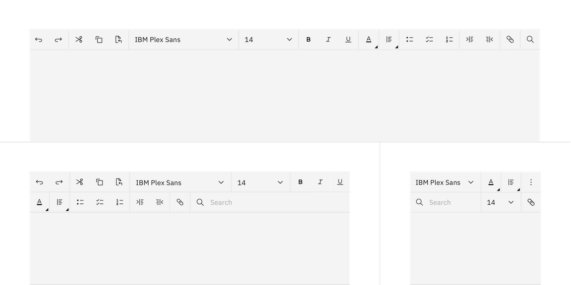
The text toolbar flexes in size to adapt to different breakpoints—max, xlg, lg, md, and sm.
| Breakpoint | Use case |
|---|---|
| max, xlg | Displays all controls and functionality in one row with the option to make the search field longer or shorter. |
| lg | The search field is truncated into a button or use an overflow menu to display collapsed controls. |
| md | Compresses the full text toolbar into two rows. |
| sm | A more compact version of “md” with collapsed controls in an overflow menu. |
Overflow
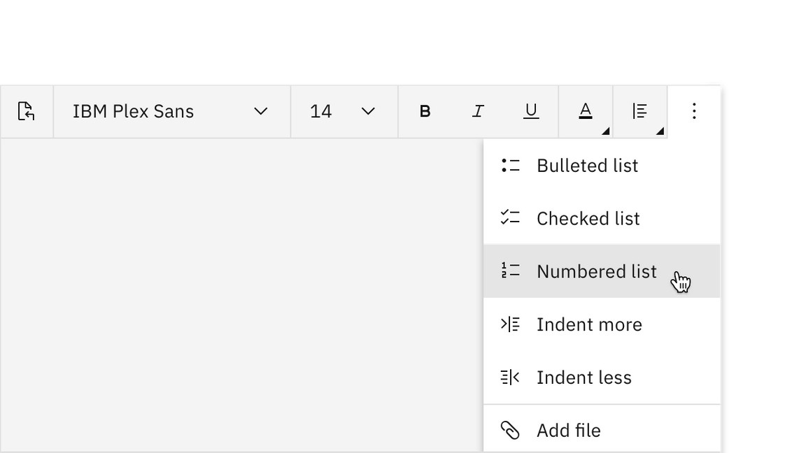
The overflow menu is used to display a list of multiple controls when horizontal space for the toolbar becomes restricted or when it is adapting to breakpoints.
Saving
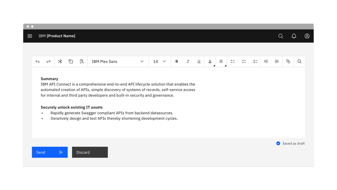
Text toolbars can be used to save or send text files. Text files can also be saved as drafts to be edited again at a later date. Drafts can be saved with an explicit “Save draft” button or it can autosave depending on the use case.
Accessibility
Tooltips
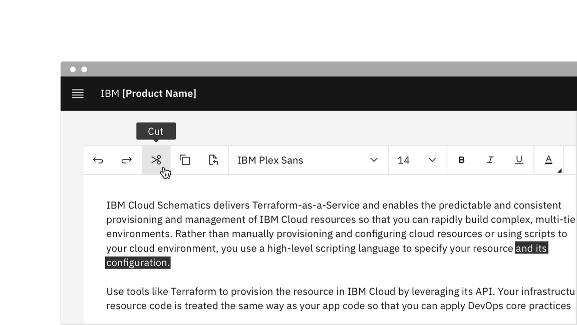
Buttons that complete an action upon click receive tooltips on hover and focus.
Keyboard
Tab and Shift + Tab move focus in and out of the toolbar.
When focus moves into a toolbar:
- If focus is moving into the toolbar for the first time, focus is set on the first control that is not disabled.
- If the toolbar has previously contained focus, focus is optionally set on the control that last had focus. Otherwise, it is set on the first control that is not disabled.
Horizontal toolbars:
- The
Left Arrowmoves focus to the previous control. - The
Right Arrowmoves focus to the next control.
Menus:
- The
Up ArrowandDown Arrownavigate to different options within a menu. - Open and close a menu by pressing
Enter.
Screen readers
When a set of controls is visually presented as a group, the toolbar role can
be used to communicate the presence and purpose of the grouping to screen reader
users. Grouping controls into toolbars can also be an effective way of reducing
the number of tab stops in the keyboard interface.
For further accessibility guidance of text toolbars, see WAI-ARIAs guidelines.
Related
References
- 3.23 Toolbar, W3C WAI-ARIA Authoring Practices (W3C Working Group Note, 2019)
- Toolbar Example, W3C WAI-ARIA design pattern (W3C Working Group Note, 2019)
Feedback
Help us improve this pattern by providing feedback, asking questions, and leaving any other comments on GitHub.